隔离地开发组件
通常,在一个应用中,你有很多 UI 组件,每个组件都有许多不同的状态。例如,一个基本的按钮组件可能具有以下状态:
¥Usually, in an app, you have a lot of UI components, and each of them has many different states. For an example, a basic button component could have the following states:
在常规状态中,带有文本标签。
¥In a regular state, with a text label.
在禁用模式中。
¥In the disabled mode.
在加载状态中。
¥In a loading state.
通常,如果不运行样本应用或一些示例,很难看到这些状态。
¥Usually, it’s hard to see these states without running a sample app or some examples.
默认情况下,Create React App 不包含任何工具,但你可以将 用于 React 的 Storybook (源码) 或 React Styleguidist (源码) 添加到你的项目中。这些第三方工具可让你开发组件并独立于应用查看其所有状态。
¥Create React App doesn’t include any tools for this by default, but you can add Storybook for React (source) or React Styleguidist (source) to your project. These are third-party tools that let you develop components and see all their states in isolation from your app.
你还可以将 Storybook 或风格指南部署为静态应用。这样,你团队中的每个人都可以查看和审查 UI 组件的不同状态,而无需启动后端服务器或在你的应用中创建账户。
¥You can also deploy your Storybook or style guide as a static app. This way, everyone in your team can view and review different states of UI components without starting a backend server or creating an account in your app.
开始使用 Storybook
¥Getting Started with Storybook
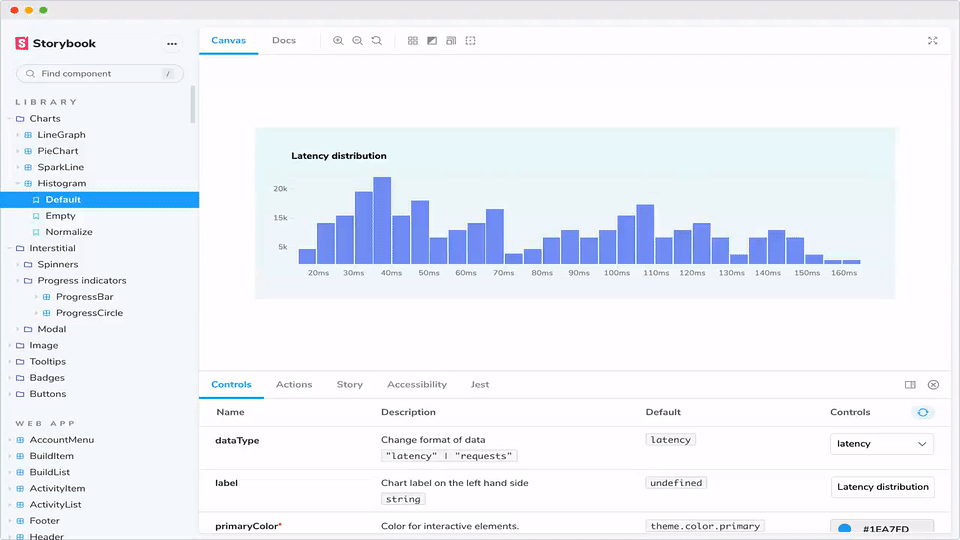
Storybook 是 React UI 组件的开发环境。它允许你浏览组件库,查看每个组件的不同状态,并交互式地开发和测试组件。
¥Storybook is a development environment for React UI components. It allows you to browse a component library, view the different states of each component, and interactively develop and test components.
在你的应用目录中运行以下命令:
¥Run the following command inside your app’s directory:
npx sb init
之后,按照屏幕上的说明进行操作。
¥After that, follow the instructions on the screen.
了解有关 React Storybook 的更多信息:
¥Learn more about React Storybook:
使用 Storybook + addon/storyshot 快照测试用户界面
¥Snapshot Testing UI with Storybook + addon/storyshot
开始使用 Styleguidist
¥Getting Started with Styleguidist
Styleguidist 结合了一个风格指南,其中所有组件都在一个页面上展示了它们的属性文档和使用示例,以及一个独立开发组件的环境,类似于 Storybook。在 Styleguidist 中,你可以使用 Markdown 编写示例,其中每个代码片段都渲染为实时可编辑的在线运行。
¥Styleguidist combines a style guide, where all your components are presented on a single page with their props documentation and usage examples, with an environment for developing components in isolation, similar to Storybook. In Styleguidist you write examples in Markdown, where each code snippet is rendered as a live editable playground.
首先,安装 Styleguidist:
¥First, install Styleguidist:
npm install --save react-styleguidist
或者你可以使用 yarn:
¥Alternatively you may use yarn:
yarn add react-styleguidist
然后,将这些脚本添加到你的 package.json:
¥Then, add these scripts to your package.json:
   "scripts": {
+    "styleguide": "styleguidist server",
+    "styleguide:build": "styleguidist build",
     "start": "react-scripts start",
然后,在你的应用目录中运行以下命令:
¥Then, run the following command inside your app’s directory:
npm run styleguide
之后,按照屏幕上的说明进行操作。
¥After that, follow the instructions on the screen.
了解有关 React Styleguidist 的更多信息:
¥Learn more about React Styleguidist: